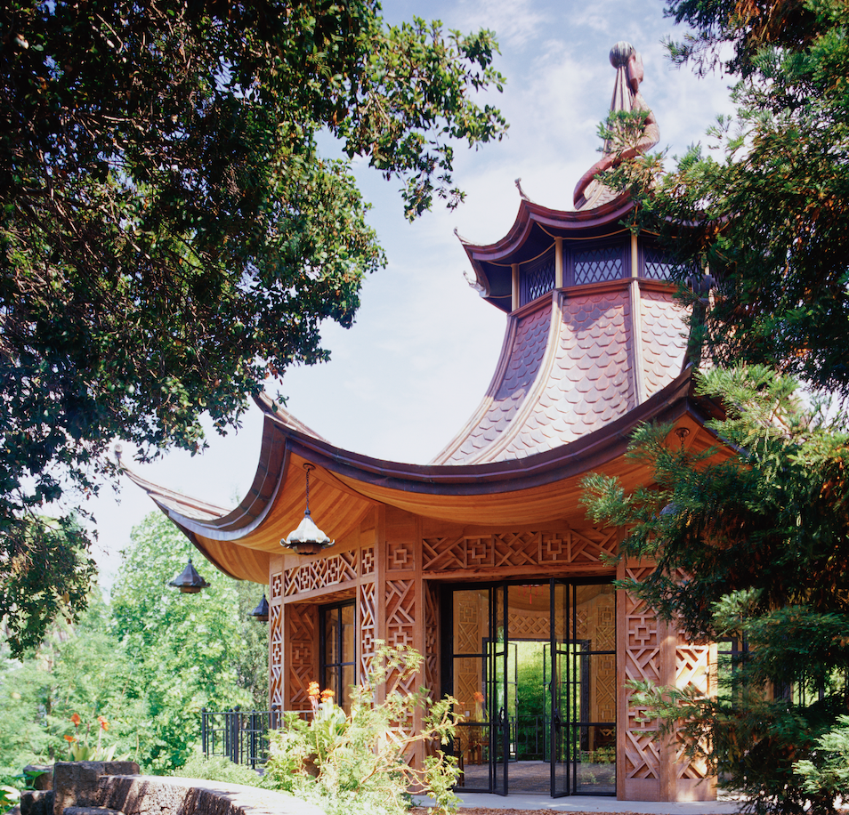
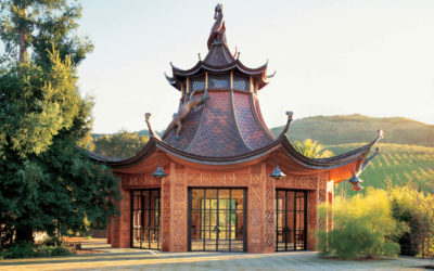
An international decorating team called our studio one afternoon. A Chinese pavilion was being built and the designers wanted to meet about painting the interior. They messengered over the plans. Unrolling the thick plan set, I expected to see a fascinating folly design, maybe something eighteen feet across. But my scale ruler measured the octagonal diameter at 86 feet!
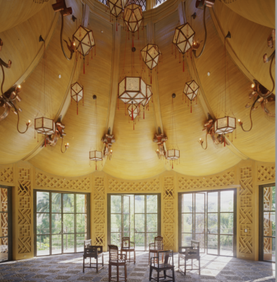
The original notion, according to the design team, was that ranch workers, one rainy winter, crafted the building from random lumber. The entire interior was to be built of cedar and redwood, even the billowing curves creating a high, tent-like ceiling. The bold lattice on the walls, made from chunky sticks of redwood, was left natural, unsanded, irregular, as though assembled from kindling.
Our first sample, on a treillage mock up, featured polychrome variations suggested by the designers: matte sky blue, true green and brick red, with aged and distressed gilding. We sourced matte gouache from a manufacturer in Australia and with confidence ordered large quantities in a variety of colors. Meanwhile, the exotic floor pattern, a combination of pebbles and arcs of sliced roof tiles, took months to complete, and during the delay, sample after sample led us further away from the polychromatic idea.
We were at an impasse. A few weeks later the client invited all the artisans to lunch at the olive ranch and we toured the construction site. Inside the grand space, stepping carefully over the almost completed floor, the client vetoed the polychrome idea. She envisioned the redwood exterior would weather naturally, over decades, to a very dark tone. She wanted the interior to be a joyous surprise, a golden delight—all surfaces in one color, gently aged, perhaps with a gleam of varnish.
I sampled some golden variations, using oil primer mixed with Swedish tung oil. This formula would feed the wood and seal in the tannins. A base coat mixture of a warm tan tone was applied by brush over the entire interior. A second coat, more tung oil mixed with varnish, was tinted with raw sienna, permanent exterior yellow and umber pigments. Under the brush these tints bloomed and spread. Raw sienna doesn’t show in the bucket, only under the brush. Why? The pressure on the brush releases the color, and each artisan’s stroke and strength create a subtle random effect. By moving the team around to different areas the rich golden color shifts in a mysterious way. The tung oil dried with a gentle sheen. We were almost there…
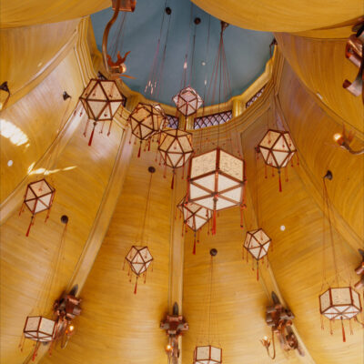
I like to use the notion of heart and soul when creating a finish, and the golden result was juicy, warm, and powerful. But was it sexy? One designer on the team agreed, we needed something more. Together we mixed pearlescent powdered pigment, a brilliant aqua, into clear glaze. This unexpected, transparent aqua, when discretely applied to some creases and connections of the treillage and five percent of the shadowy areas of the vaulted ceiling, gave shape and mood, and again, depending on the hand of the artisan, dried in a range between delicate aqua to mossy green. Only those who looked closely would see glints of the secret pearl accent that gave weight, whimsy and cool contrast to the blast of vibrant yellow on the entire structure.
The same striking aqua tone, in plain paint, was applied at the apex of the vaulted ceiling. When the scaffolding came down and the ladders and tarps were removed, we met with the client. She stood in the center of the sundrenched room and looked up, then smiled. She was right, simple was better. We still have a some of those bright colored, unopened containers of gouache in the studio, twenty years later.


Beautiful project, the result may appear simple, the process was anything but. Buen trabajó
Eb